TZM Realty is a long-established real estate firm and owner of multiple properties in and around New York City. They had a dedicated client base, but an antiquated website. They wanted a fresh new look and an easy-to-maneuver site for their listings, several highly visible ways for potential clients to reach them quickly, and a template for a newsletter e-blast to send to their growing database.
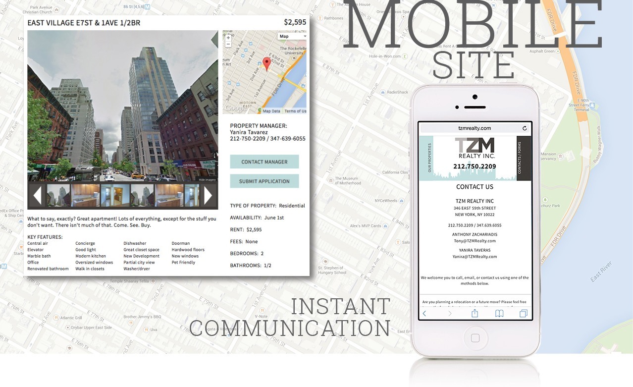
We determined their site structure essentially boiled down to two main areas: one for property listings, and another to contact the property managers. With this in mind, we designed a simple two-tab menu to flip back and forth between sections, front-and-center contact methods on each property listing, and general information forms that prospective clients can download or complete for a quick response.
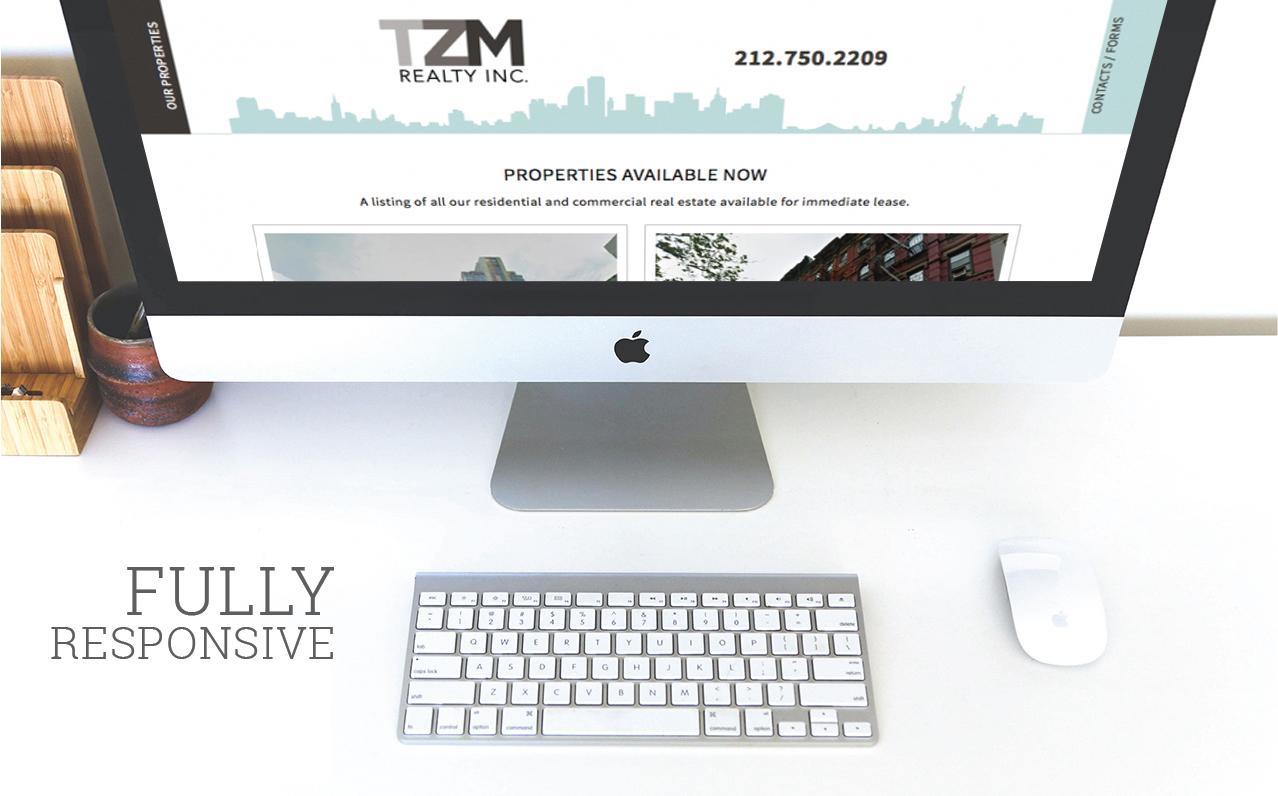
We built their new site in WordPress with a customized, intuitive, and easy-to-use interface on the back end—they love how quickly and simply they can add and update properties during rapid rental property turnovers. We also made the site layout responsive and scalable across screen sizes and platforms. It looks and works great on desktops, tablets, and smartphones. We set them up with a great 3rd party newsletter mailing service and their slick newsletter template brings their new branding full circle.
Tony and the rest of the TZM staff love their new look, website, logo, and branding; the overhaul has definitely upped their street cred! When our clients are happy, we’re happy. Congrats on the upgrade, TZM!


